Sunrise: 00
Sunset: 00
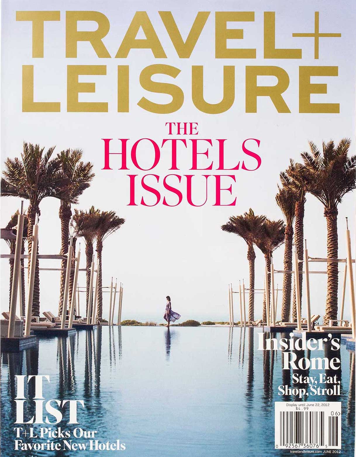
LEISURE
main of all the books in the world, the best stories are found between the pages of a passport
Travel + Leisure is one of the world's top travel magazines, lively mix of travelogue and useful information. Published by American Express, the magazine is recognized for its stylish photography and smart writing. Pentagram redesigned Travel + Leisure with a dynamic new format that matches the magazine's chic, sophisticated tone.
It shows a clean, modern design that clearly delineates sections and opens up page layouts.
Feature stories now run in full without interruption no more flipping to the back of the magazine and are separated by advertising, which has been introduced to the middle of the book. This allows the magazine to offer advertisers adjacencies to the larger feature stories. The structure also more easily accommodates the magazine's special packages, like June's "It List."
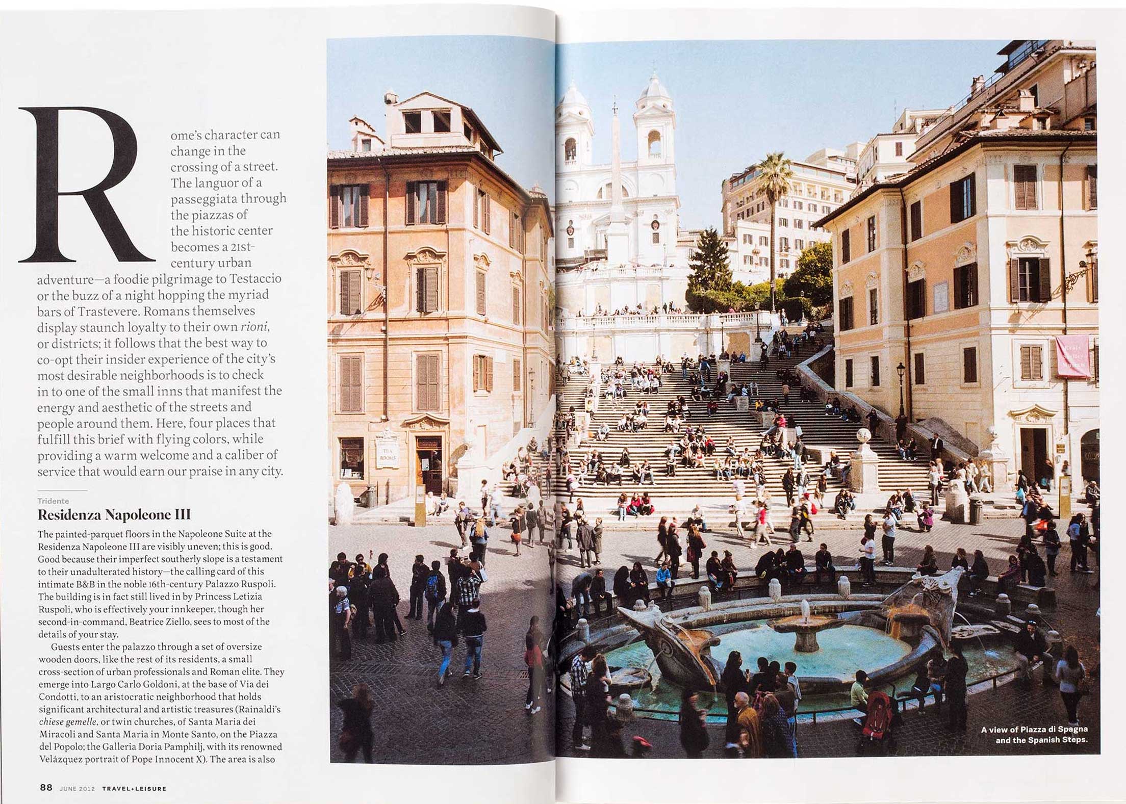
Throughout the magazine, layouts are open, airy and clean. Article text, formerly justified, is now designed flush left, and less text appears on pages, allowing layouts to breathe. The magazine is known for its evocative photography, and the design pushes the imagery to the fore in strong, simple compositions. Single page editorial content is separated from adjacent advertising with a graphic bar. Fonts used in the redesign included Superior Title and Text (the latter developed specially for the magazine) and PF Encore Sans. The new custom logotype is based on Sweet Sans.
To connect with its community of readers, the redesigned magazine incorporates user-generated content, with readers suggesting travel tips, favorite places and feedback on experiences. Web touts appear alongside articles, and the letters page incorporates social media. The back page features "Tagged," highlights travel tips from readers contributed via Facebook and Twitter.
The design incorporates more illustration and graphics, with bits of data, charts and maps appearing throughout the pages. These range from a step-by-step diagram on How to Make a Bed, Hotel-Style to plotting hotel amenities along a continuum of "Overhyped," "Underrated" and "Just Right."
The magazine's maps previously appeared in a variety of different styles, and the redesign establishes a consistent look for the maps with a standard set of icons and color palette.